Changing course, made clear
Contrails.org, a non-profit initiative launched by Breakthrough Energy, is at the forefront of aviation’s climate revolution. As they relaunched with a renewed mission, they partnered with Applied arts to design a new brand that would establish them as a trusted scientific voice while driving engagement with key stakeholders in technology, policy and aviation sectors. Over just a 9-week timeline, we designed a new visual identity including logo, typography, color palette and refreshed web presence reflecting their mission to transform contrail research into climate action.
Contrails.org is transforming contrail research into practical climate action, with an aim to mitigate contrail formation and drastically cut aviation’s climate impact. However, their existing brand wasn’t accurately reflecting their evolving mission and didn’t resonate clearly with stakeholders. The missing piece? A compelling visual identity that could rise above the haze. Applied arts stepped in to bring clarity to their brand and elevate their presence as a trusted scientific voice in the climate and aviation space.
Our objective was to create a brand identity that aligned with its ambitions and created engagement with the technology sector, policymakers, aviation leaders, and the scientific community. They needed a new visual and digital presence that would communicate credibility, transparency and urgency while positioning them as a collaborative and trusted voice in the field.
To begin, we conducted interviews with key stakeholders to uncover their perceptions, pain points, and aspirations for the brand. Through this research, we identified a few critical themes. The brand had to reflect Contrails.org as a data-driven organization that acts as an arbiter of truth in climate science, one that cuts through misinformation and represents transparency. Additionally, the new identity needed to convey complex scientific concepts in a digestible and actionable way that felt feasible for large-scale adoption. With these insights, we distilled the brand’s core attributes into a set of design principles that guided the new visual identity and website refresh
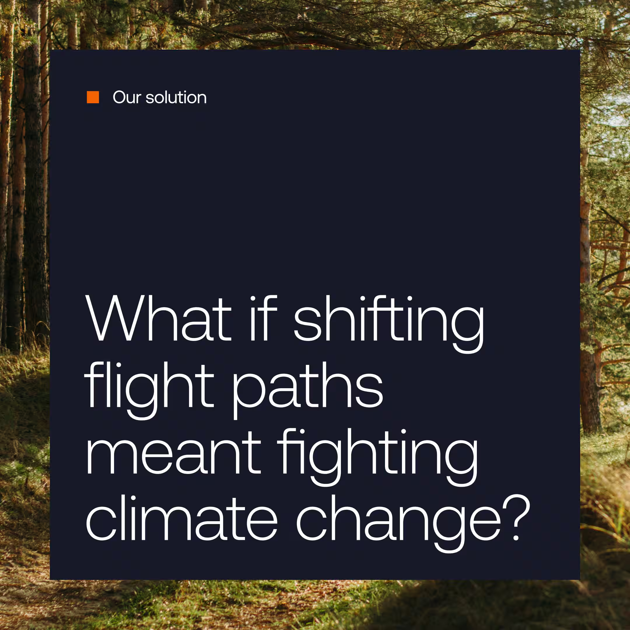
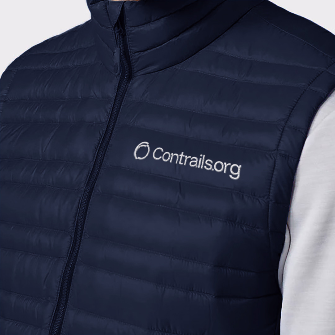
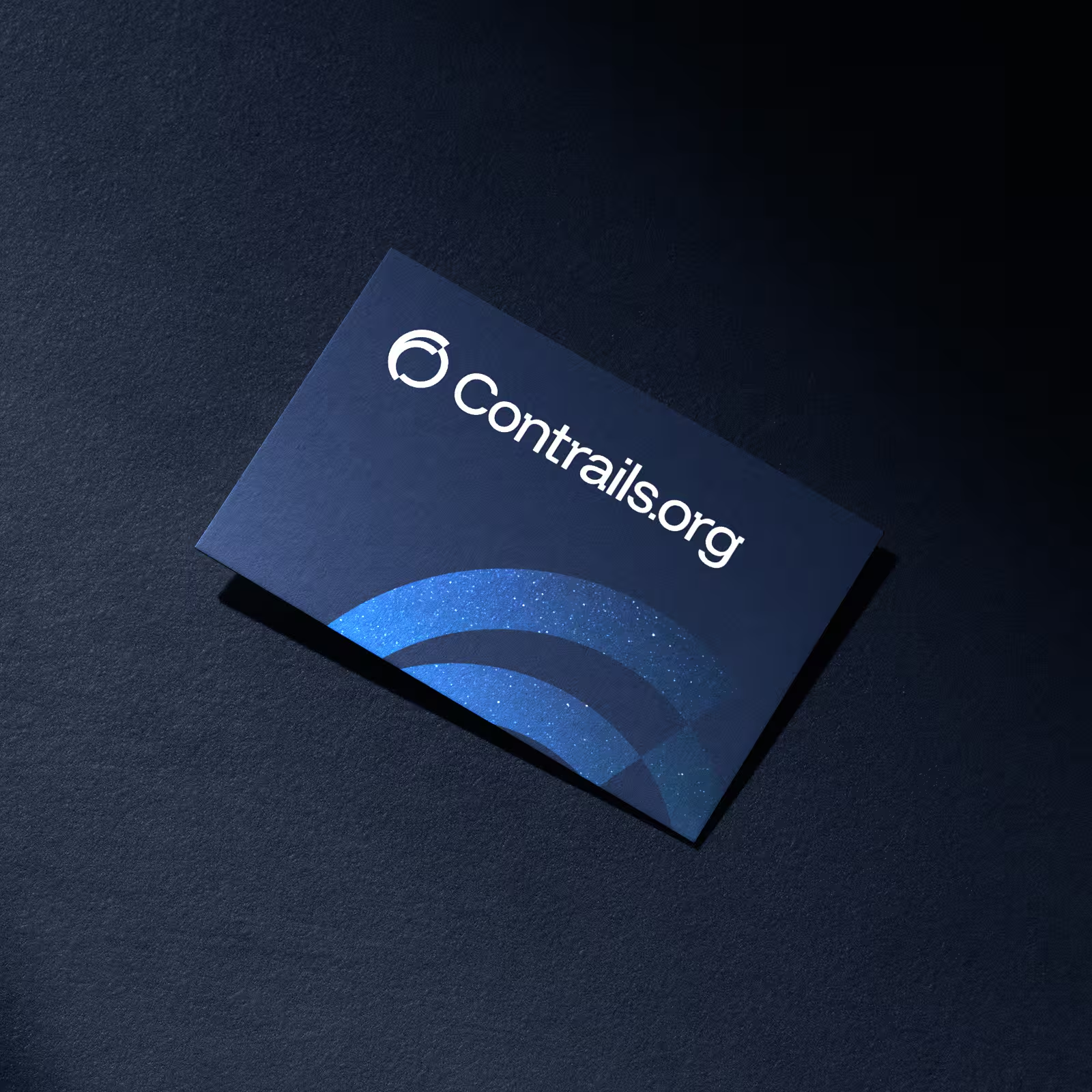
At the heart of the rebrand is the logo, featuring a distinct shift in letterform geometry, alongside a proprietary logomark which integrates elements of the Earth, contrails, and avoidance. We also incorporated a modern, approachable typeface that ensures clarity in presenting complex climate data, balancing authority with accessibility. The color palette, rooted in deep blues and crisp whites, conveys a strong, refined scientific foundation, while energetic accents of blue and orange command attention for urgent calls to action.
In addition, we designed a few key secondary elements – a signature pixel representing the small yet crucial shift in flight paths that can reduce contrails, and a cropped logo supergraphic that reflects a sense of dynamic motion and purposeful change for the climate. Finally, we pulled everything together to give the website a refreshed look, and compiled a comprehensive brand guidelines document to ensure the team could execute the new identity cohesively across channels. Together, these elements create a forward-looking identity that positions Contrails.org as a trusted leader in climate-conscious aviation.
With a renewed brand and mission, we’re proud to have helped position Contrails.org as a leading voice in contrail mitigation. The bold, refreshed identity sets the stage for their mission and lays the foundation for real climate action in aviation. A clearer sky is possible, and Contrails.org is helping chart the course.